This is Forge, our interface framework and pattern library. It defines a set of base styles and common patterns shared throughout our website. It's a strong foundation for building beautiful interfaces.
Forge was built for our internal needs at DoSomething.org, but it could also work for your organization. Feel free to fork our GitHub repository and use it as a starting point for your own pattern library, or read more about why we open-source our code.
Base Styles
Content is the basis for our design, so we need a strong typographic foundation. We define base HTML classes with comfortable font-size and spacing for readability, and a clear information hierarchy between elements.
Inline Elements #
Tags for inline text elements are given default styles. Adjacent paragraphs are given top margin spacing, and headings following paragraph text have increased spacing.
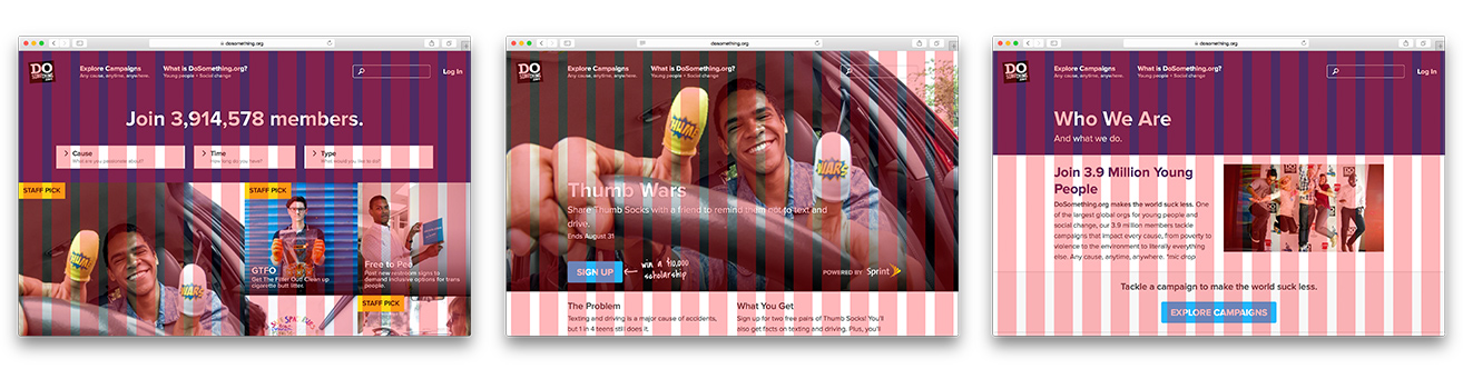
DoSomething.org makes the world suck less. One of the largest orgs for young people and social change, our members tackle campaigns that impact every cause, from poverty to violence to the environment to literally everything else.1 Any cause, anytime, anywhere. *mic drop*
This is a link, and a secondary link.
  <p>DoSomething.org <strong>makes the world suck less</strong>. One of the <mark>largest orgs
  for young people and social change</mark>, our members tackle campaigns that impact every cause,
  from poverty to violence to the environment to <em>literally</em> everything else.<sup>1</sup>
  Any cause, anytime, anywhere. *mic drop*</p>
  <p>This is a <a href="#">link</a>, and a <a href="#" class="secondary">secondary link</a>.</p>
Fonts & Colors
We use Source Sans Pro for all headings and body copy.
We use Covered By Your Grace as the "voice" of DoSomething.org.
Any cause, anytime, anywhere. ($font-handwritten, $weight-normal)
We have three primary brand colors.
-
Blue
($blue) … -
Purple
($purple) … -
Yellow
($yellow) …
For consistency, we try to use these four grayscale values throughout our interfaces.
-
Off Black
($off-black) … -
Dark Gray
($dark-gray) … -
Medium Gray
($med-gray) … -
Light Gray
($light-gray) …
They're not part of our brand, but we use these guys in special cases.
-
Errors
($error-color) …
Tip: Double-click on a swatch to switch between color formats.
Grid System
We use Susy 2 to build our interface on a fluid grid. This promotes consistency and provides rules for layouts to comfortably expand and contract in a multi-device world. Our grid is split up into sixteen columns, with a 24 pixel static gutter between columns.
See the Susy documentation for implementation details.
Animation
We use animation to add a sense of playfulness and delight to our interface. Animations also hint at functionality and inform the user's mental model of how an interface functions.
Components
We don't want to re-invent the wheel. Re-usable interface patterns are catalogued within Forge to promote consistency throughout our interfaces and minimize code bloat. We start by defining atomic components. These are the smallest building blocks of our interfaces.
Avatar #
Rounded image. Used to show a user profile image.
   <div class="avatar">
     <img src="/styleguide/assets/placeholder.jpg" />
   </div>
Chat Bubble #
Used for longer conversational messaging, such as a note from a campaign lead.
  <div class="chat-bubble">
    1 items collected! That’s amazing - thanks to everyone for rocking Hunt
    Day 2: Trash Scavenger Hunt. Let’s keep it up! Add your contribution in
    the Prove It section below.
  </div>
Forms - Button #
Buttons are generally used for interface actions. Suitable for all-purpose use. Defaults to primary call-to-action appearance.
<a class="button {{modifier_class}}">Example Button</a>Forms - Form Item #
A label and a form element.
  <div class="form-item {{modifier_class}}">
    <label class="field-label">Field Label</label>
    <input type="text" class="text-field">
  </div>
Forms - Form Actions #
Container for form actions, such as submit buttons.
  <div class="form-actions {{modifier_class}}">
    <input type="submit" class="button" value="Submit">
  </div>
  <ul class="form-actions {{modifier_class}}">
    <li><a href="#">Forgot your password?</a></li>
    <li><a href="#">Create an account</a></li>
  </ul>
Forms - Inline Form Actions #
Container for form actions, with all items shown in a row.
  <ul class="form-actions -inline {{modifier_class}}">
    <li><input type="submit" class="button" value="Submit"></li>
    <li><input type="submit" class="button -tertiary" value="Skip"></li>
  </ul>
Forms - Field Label #
Labels for form elements. Optional validation styles triggered by client-side validation.
  <!-- validation classes and markup generated dynamically -->
  <label class="field-label">
    <span class="validation">
      <div class="validation__message {{modifier_class}}">Field Label</div>
    </span>
  </label>
  <input class="text-field {{modifier_class}}" type="text">
Forms - Option Field #
Checkboxes and radio boxes. Progressively enhanced to look beautiful on modern browsers. Older browsers (such as Internet Explorer 8) will see platform-native controls.
  <label class="field-label">Some checkboxes</label>
  <div class="form-item">
    <label class="option -checkbox">
      <input checked type="checkbox" id="option1">
      <span class="option__indicator"></span>
      <span>Choose this option.</span>
    </label>
    <label class="option -checkbox">
      <input type="checkbox" id="option2">
      <span class="option__indicator"></span>
      <span>Choose that option.</span>
    </label>
    <label class="option -checkbox">
      <input type="checkbox" id="option3">
      <span class="option__indicator"></span>
      <span>Choose this unreasonably long-winded and ultimately pointless option.</span>
    </label>
  </div>
  <label class="field-label">Some radio buttons</label>
  <div class="form-item">
    <label class="option -radio">
      <input checked type="radio" name="choice" id="choice1">
      <span class="option__indicator"></span>
      <span>Choose one option.</span>
    </label>
    <label class="option -radio">
      <input type="radio" name="choice" id="choice2">
      <span class="option__indicator"></span>
      <span>Choose the other option.</span>
    </label>
  </div>
Forms - Media Option Field #
Custom single or multi-select option styles to mimic behavior of radio buttons and checkboxes. Progressively enhanced to look beautiful on modern browsers.
  <div class="form-item">
    <label class="media-option -radio">
      <input type="radio" value="value1" name="item" id="option1" checked="checked">
      <img alt="kitten overlords" src="/styleguide/assets/placeholder-small.jpg">
    </label>
    <label class="media-option -radio">
      <input type="radio" value="value2" name="item" id="option2">
      <img alt="kitten overlords" src="/styleguide/assets/placeholder-small.jpg">
    </label>
  </div>
Forms - Select Box #
Select boxes present a list of options on a form.
  <div class="select {{modifier_class}}">
    <select>
      <option>Awesome Things</option>
      <option>Popular Things</option>
      <option>Random Things</option>
    </select>
  </div>
Forms - Text Field #
Single-line text input fields.
<input type="text" class="text-field {{modifier_class}}" placeholder="Type something...">Footnote #
The fine print. Use for legal text, disclaimers, references, or help text. Use .js-footnote-toggle
and .js-footnote-hidden to create toggleable content. See footnote.js for implementation.
Legal text example:
By clicking submit, you agree to sell your soul to the lorem ipsum dolor sit amet.
Source footnote example:
Sources
- 1 Clark, Barry. "A Treatise on The Motherland", British Royal Archives, 2009.
- 2 Lorch, Julie. "Coffee Sure Is Great", Royal Academy of Coffee, 2010.
  <h4>Legal text example:</h4>
  <p class="footnote">By clicking submit, you agree to <a href="#">sell your soul</a> to the lorem ipsum dolor sit amet.</p>
  <h4>Source footnote example:</h4>
  <div class="footnote">
    <h4 class="js-footnote-toggle">Sources</h4>
    <ul class="js-footnote-hidden">
      <li><sup>1</sup> Clark, Barry. "A Treatise on The Motherland", British Royal Archives, 2009.</li>
      <li><sup>2</sup> Lorch, Julie. "Coffee Sure Is Great", Royal Academy of Coffee, 2010.</li>
    </ul>
  </div>
Heading #
Various heading weights and styles.
Heading
Heading
h1 tagsHeading
h2 tagsHeading
h3 tagsHeading
h4, h5, and h6 tagsHeading
.-emphasized instead, using Container pattern for appropriate margins.)Heading
Heading
Heading
<h2 class="heading {{modifier_class}}"><span>Heading</span></h2>List #
List of items. You can use the .with-lists class to apply list styles to all ol and ul
within a container, for example when styling Markdown content.
An unordered list:
- Lorem ipsum dolor sit amet, consectetur adipiscing elit. In non pretium risus. Sed ultrices dolor magna, in ultricies sapien ornare ac.
- Curabitur sed odio aliquet, efficitur diam vel, laoreet ipsum. Curabitur faucibus tincidunt augue.
- In non pretium risus. Sed ultrices dolor magna, in ultricies sapien ornare ac.
And an ordered list:
- Know it.
- Plan it.
- ???
- Profit.
  <p>An unordered list:</p>
  <ul class="list {{modifier_class}}">
    <li>Lorem ipsum dolor sit amet, consectetur adipiscing elit. In non pretium risus. Sed ultrices dolor magna, in ultricies sapien ornare ac.</li>
    <li>Curabitur sed odio aliquet, efficitur diam vel, laoreet ipsum. Curabitur faucibus tincidunt augue.</li>
    <li>In non pretium risus. Sed ultrices dolor magna, in ultricies sapien ornare ac.</li>
  </ul>
  <p>And an ordered list:</p>
  <ol class="list {{modifier_class}}">
    <li>Know it.</li>
    <li>Plan it.</li>
    <li>???</li>
    <li>Profit.</li>
  </ol>
Media Video #
Make embedded videos scale responsively.
<div class="media-video">
<iframe width="560" height="315" src="//www.youtube.com/embed/bkK2C0iBFt8?rel=0&showinfo=0"
frameborder="0" allowfullscreen></iframe>
</div>Message Callout #
Handwritten text callout with arrow pointing to other content.
  <div class="message-callout {{modifier_class}}">
    <div class="message-callout__copy">
      <p>This is something. Mic drop!</p>
    </div>
  </div>
Messages #
Status message styles. These should be used to provide feedback to the user for
events that occur outside the normal application flow (such as application errors).
Close button is added using JavaScript. See system-messages.js.
  <div class="messages {{modifier_class}}">
    <strong>There's something <em>I need</em></strong> to tell you.
  </div>
Social icons are used to link to social networks, or to link sharing actions. #
<a class="social-icon {{modifier_class}}"><span>Text Fallback</span></a>Spinner #
A spinner is used to indicate loading content. Uses an animated SVG on modern browsers, with fallback to an animated GIF based on feature detection.
<div class="spinner"></div>Waypoints #
Used to navigate between sections/panels/pages within an interface. Apply .is-active class to
list element for "active" state.
  <ul class="waypoints {{modifier_class}}">
    <li class="is-active"><a href="#">Section One</a></li>
    <li><a href="#">Section Two</a></li>
    <li><a class="waypoints__primary-link" href="#">Section Three</a></li>
  </ul>
Modules
Modules are groups of components, and generally work as a standalone part of an interface. They may even contain other modules (for example, the gallery module contains multiple tile modules).
Bragging Gallery #
Did we kill it on something? This is the perfect component for showcasing a large photo with a bit of text attached. This could be a great media snapshot, celebrity endorsment or even a member callout.
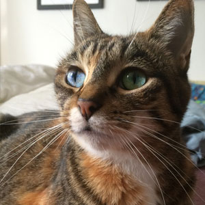
Grand Prize
Look at this cat. How'd she get so god-damned cute? What gives her the right? Who does she think she is?
  <article class="figure -left -center">
    <div class="figure__media">
      <img alt="winning cat" src="/styleguide/assets/placeholder.jpg" />
    </div>
    <div class="figure__body">
      <h2 class="heading -emphasized">Grand Prize</h2>
      <p><strong>Look at this cat.</strong> How'd she get so god-damned cute?
      What gives her the right? Who does she think she is?</p>
    </div>
  </article>
Call To Action #
The Call To Action module is used to show show a short "call to action" message with an accompanying button or set of actions. CTAs typically span the full width of the page.
  <div class="cta">
    <div class="cta__block">
      <p class="cta__message">Miscreant! You should pay homage to our future kitten overlords:</p>
    </div>
    <div class="cta__block">
      <a href="#" class="button">Support Our Kittens</a>
    </div>
  </div>
  <br/>
  <div class="cta">
    <div class="cta__block">
      <p class="cta__message">Rejoice, and share the good news of our benevolent feline rulers:</p>
    </div>
    <ul class="cta__actions">
      <li><a href="#" class="social-icon -facebook"><span>Facebook</span></a></li>
      <li><a href="#" class="social-icon -twitter"><span>Twitter</span></a></li>
      <li><a href="#" class="social-icon -tumblr"><span>Tumblr</span></a></li>
    </ul>
  </div>
Figure #
A figure block usually contains an image with a title and a description.
<article class="figure {{modifier_class}}">
<div class="figure__media">
<img alt="kitten overlords" src="/styleguide/assets/placeholder.jpg" />
</div>
<div class="figure__body">
<b>Teen Vogue</b> featured Comeback Clothes as one of the ways
fashion brands like H&M are taking eco-chic to the next level.
</div>
</article>Gallery #
Generic module class for all galleries. Galleries can contain items of any type (e.g. tile, figure, etc.) Requires an additional modifier classes to designate a specific type of gallery (see modifiers below).
Gallery - Quartet #
A "quartet" gallery shows four items per row. Galleries can contain items of
any type but work particularly well with Figures and Tiles. May optionally
include a heading within .gallery__heading.
  <ul class="gallery -quartet">
    <div class="gallery__heading">
      <h2>Gallery Heading</h2>
    </div>
    <li>
      <article class="tile">
        <a class="wrapper" href="#">
          <div class="tile__meta">
            <h1 class="tile__title">Kitten Overlord</h1>
          </div>
          <img alt="kitten overlords" src="/styleguide/assets/placeholder.jpg" />
        </a>
      </article>
    </li>
    <li>
      <article class="tile tile--campaign">
        <a class="wrapper" href="#">
          <div class="tile__meta">
            <h1 class="tile__title">Kitten Overlord</h1>
          </div>
          <img alt="kitten overlords" src="/styleguide/assets/placeholder.jpg" />
        </a>
      </article>
    </li>
  </ul>
Gallery - Triad #
A "triad" gallery shows three items per row. Galleries can contain items of
any type but work particularly well with Figures and Tiles. May optionally
include a heading within .gallery__heading.
-
Teen Vogue featured Comeback Clothes as one of the ways fashion brands like H&M are "taking eco-chic to the next level."
-
Seventeen ran an Earth Day story about recycling old fabrics through DoSomething.org and H&M's Comeback Clothes.
-
Nylon urged readers to clean out their closets and do good for the planet by recycling old clothes at H&M.
Gallery Heading
-
Teen Vogue featured Comeback Clothes as one of the ways fashion brands like H&M are "taking eco-chic to the next level."
-
Seventeen ran an Earth Day story about recycling old fabrics through DoSomething.org and H&M's Comeback Clothes.
-
Nylon urged readers to clean out their closets and do good for the planet by recycling old clothes at H&M.
Gallery Heading
<ul class="gallery -triad {{modifier_class}}">
<div class="gallery__heading">
<h2>Gallery Heading</h2>
</div>
<li>
<div class="figure">
<div class="figure__media">
<img alt="kitten overlords" src="/styleguide/assets/placeholder.jpg" />
</div>
<div class="figure__body">
<b>Teen Vogue</b> featured Comeback Clothes as one of the ways
fashion brands like H&M are "taking eco-chic to the next level."
</div>
</div>
</li>
<li>
<div class="figure">
<div class="figure__media">
<img alt="kitten overlords" src="/styleguide/assets/placeholder.jpg" />
</div>
<div class="figure__body">
<b>Seventeen</b> ran an Earth Day story about recycling old fabrics
through DoSomething.org and H&M's Comeback Clothes.
</div>
</div>
</li>
<li>
<div class="figure">
<div class="figure__media">
<img alt="kitten overlords" src="/styleguide/assets/placeholder.jpg" />
</div>
<div class="figure__body">
<b>Nylon</b> urged readers to clean out their closets and do good for
the planet by recycling old clothes at H&M.
</div>
</div>
</li>
</ul>Gallery - Duo #
A "duo" gallery shows two items per row. Galleries can contain items of
any type but work particularly well with Figures and Tiles. May optionally
include a heading within .gallery__heading.
-

@HarryShumJr
Do you have stained or ripped clothes you don't wear? Recycle them w/ @DoSomething http://dsorg.us/CLOTHES
-
@HarryShumJr
Do you have stained or ripped clothes you don't wear? Recycle them w/ @DoSomething http://dsorg.us/CLOTHES
Gallery Heading
  <ul class="gallery -duo">
    <div class="gallery__heading">
      <h2>Gallery Heading</h2>
    </div>
    <li>
      <article class="figure -left">
        <div class="figure__media">
          <img alt="kitten overlords" src="/styleguide/assets/placeholder-small.jpg" />
        </div>
        <div class="figure__body">
          <h3><a href="http://twitter.com/harryshumjr">@HarryShumJr</a></h3>
          <p>
            Do you have stained or ripped clothes you don't wear? Recycle them
            w/ <a href="http://twitter.com/dosomething">@DoSomething</a>
            <a href="http://twitter.com/hmusa">http://dsorg.us/CLOTHES</a>
          </p>
        </div>
      </article>
    </li>
  </ul>
Gallery - Featured #
Gallery style which emphasizes the first item in the gallery.
Works best when paired with the gallery's -quartet and -mosaic modifier classes.
  <ul class="gallery -quartet -mosaic -featured">
    <li>
      <article class="tile">
        <a class="wrapper" href="#">
          <div class="tile__meta">
            <h1 class="tile__title">Kitten Overlord</h1>
          </div>
          <img alt="kitten overlords" src="/styleguide/assets/placeholder.jpg" />
        </a>
      </article>
    </li>
    <li>
      <article class="tile tile--campaign">
        <a class="wrapper" href="#">
          <div class="tile__meta">
            <h1 class="tile__title">Kitten Overlord</h1>
          </div>
          <img alt="kitten overlords" src="/styleguide/assets/placeholder.jpg" />
        </a>
      </article>
    </li>
    <li>
      <article class="tile tile--campaign">
        <a class="wrapper" href="#">
          <div class="tile__meta">
            <h1 class="tile__title">Kitten Overlord</h1>
          </div>
          <img alt="kitten overlords" src="/styleguide/assets/placeholder.jpg" />
        </a>
      </article>
    </li>
    <li>
      <article class="tile tile--campaign">
        <a class="wrapper" href="#">
          <div class="tile__meta">
            <h1 class="tile__title">Kitten Overlord</h1>
          </div>
          <img alt="kitten overlords" src="/styleguide/assets/placeholder.jpg" />
        </a>
      </article>
    </li>
  </ul>
Gallery - Mosaic #
Removes spacing between gallery items. This is typically used with our Tile pattern.
  <ul class="gallery -quartet -mosaic">
    <li>
      <article class="tile">
        <a class="wrapper" href="#">
          <div class="tile__meta">
            <h1 class="tile__title">Kitten Overlord</h1>
          </div>
          <img alt="kitten overlords" src="/styleguide/assets/placeholder.jpg" />
        </a>
      </article>
    </li>
    <li>
      <article class="tile tile--campaign">
        <a class="wrapper" href="#">
          <div class="tile__meta">
            <h1 class="tile__title">Kitten Overlord</h1>
          </div>
          <img alt="kitten overlords" src="/styleguide/assets/placeholder.jpg" />
        </a>
      </article>
    </li>
    <li>
      <article class="tile tile--campaign">
        <a class="wrapper" href="#">
          <div class="tile__meta">
            <h1 class="tile__title">Kitten Overlord</h1>
          </div>
          <img alt="kitten overlords" src="/styleguide/assets/placeholder.jpg" />
        </a>
      </article>
    </li>
    <li>
      <article class="tile tile--campaign">
        <a class="wrapper" href="#">
          <div class="tile__meta">
            <h1 class="tile__title">Kitten Overlord</h1>
          </div>
          <img alt="kitten overlords" src="/styleguide/assets/placeholder.jpg" />
        </a>
      </article>
    </li>
  </ul>
Info Bar #
The Info Bar contains left and right-aligned content areas, and typically lives above the footer.
  <footer class="info-bar {{modifier_class}}">
    <div class="wrapper">
      Sponsored by <a href="#">Puppet Sloth</a>.
      <div class="info-bar__secondary">Questions? <a href="#">Contact Us</a></div>
    </div>
  </footer>
Polaroid #
Module class for styling a figure with a "polaroid" effect.
  <figure class="polaroid">
    <img src="/styleguide/assets/placeholder.jpg" alt="another kitten">
  </figure>
Social Menu #
A group of Social Icons, used for share actions or linking to social media accounts.
-above-horizontal Message Callout. <ul class="social-menu {{modifier_class}}">
<li><a class="social-icon -facebook" href="#"><span>Facebook</span></a></li>
<li><a class="social-icon -twitter" href="#"><span>Twitter</span></a></li>
<li><a class="social-icon -tumblr" href="#"><span>Tumblr</span></a></li>
</ul>Tabs #
Tabbed container. Gracefully degrades into plain text if JavaScript is disabled. Extends the Waypoints patterns for tab navigation.
Tips
-
Find Maxwell
He's drinking 'fee. But he needs some more 'fee.
-
Give Him 'Fee
Give him some 'fee. You'll get 300 points in the Intern Scavenger Hunt.
Tips
Find Maxwell
He's drinking 'fee. But he needs some more 'fee.
Give Him 'Fee
Give him some 'fee. You'll get 300 points in the Intern Scavenger Hunt.
  <section class="tabs js-tabs">
    <a href="#" data-modal-href="#modal-tips-during" class="tabs__modal-toggle">View Tips</a>
    <h4 class="visually-hidden">Tips</h4>
    <div class="wrapper">
      <nav class="tabs__menu">
        <ul class="waypoints">
          <li class="is-active"><a href="#tip-1" data-tab="1">Find Maxwell</a></li>
          <li><a href="#tip-2" data-tab="2">Give Him 'Fee</a></li>
        </ul>
      </nav>
      <ul class="tabs__body">
        <li id="tip-1" class="tabs__tab">
          <h5 class="tabs__title">Find Maxwell</h5>
          <p>He's drinking 'fee. But he needs some more 'fee.</p>
        </li>
        <li id="tip-2" class="tabs__tab">
          <h5 class="tabs__title">Give Him 'Fee</h5>
          <p>Give him some 'fee. You'll get 300 points in the Intern Scavenger Hunt.</p>
        </li>
      </ul>
    </div>
  </section>
  <div data-modal id="modal-tips-during" class="modal--tips" role="dialog">
    <h2 class="heading -banner">Tips</h2>
    <div class="modal__block">
      <h4 class="inline--alt-color">Find Maxwell</h4>
      <p>He's drinking 'fee. But he needs some more 'fee.</p>
    </div>
    <div class="modal__block">
      <h4 class="inline--alt-color">Give Him 'Fee</h4>
      <p>Give him some 'fee. You'll get 300 points in the Intern Scavenger Hunt.</p>
    </div>
    <div class="modal__block form-actions">
      <a href="#" class="js-close-modal">Back to main page</a>
    </div>
  </div>
Tile #
A tile block contains an image with an overlaid title and tagline. Generally used for campaigns, but can be used in any context.
  <article class="tile">
    <a class="wrapper" href="#">
      <div class="tile__meta">
        <h1 class="tile__title">Kitten Overlords</h1>
        <p class="tile__tagline">According to the latest research, kittens will outlive the human species after the apocalypse.</p>
      </div>
      <img alt="kitten overlords" src="/styleguide/assets/placeholder-large.jpg" />
      <!-- <video src="source.mp4" width="1080" height="1080" poster="poster.png" autoplay loop></video> -->
    </a>
  </article>
Regions
Regions are complete sections of an interface.
Chrome #
The entire page should be wrapped in .chrome to lock page in
place while modals are open. The page content should be wrapped
in a .wrapper to set max-width and apply background
box shadow to the page.
Container #
Standard container for centered 12-column layouts. Collapses to full-width on mobile.
Modifier classes can be applied to the required container__block to use different
preset layouts. Optionally, the container__row class can be used to align into rows.
Apply .-padded modifier to add extra bottom padding to a container, or .-dark to
use a dark purple background which blends seamlessly with the header.
Lorem ipsum dolor sit amet, consectetur adipiscing elit. Suspendisse dapibus condimentum aliquet. Maecenas suscipit commodo dui, eu venenatis nisl volutpat.
Lorem ipsum dolor sit amet, consectetur adipiscing elit. Suspendisse dapibus condimentum aliquet. Maecenas suscipit commodo dui, eu venenatis nisl volutpat.
Lorem ipsum dolor sit amet, consectetur adipiscing elit. Suspendisse dapibus condimentum aliquet. Maecenas suscipit commodo dui, eu venenatis nisl volutpat.
Lorem ipsum dolor sit amet, consectetur adipiscing elit. Suspendisse dapibus condimentum aliquet. Maecenas suscipit commodo dui, eu venenatis nisl volutpat.
Lorem ipsum dolor sit amet, consectetur adipiscing elit. Suspendisse dapibus condimentum aliquet. Maecenas suscipit commodo dui, eu venenatis nisl volutpat.
Lorem ipsum dolor sit amet, consectetur adipiscing elit. Suspendisse dapibus condimentum aliquet. Maecenas suscipit commodo dui, eu venenatis nisl volutpat.
  <div class="container">
    <div class="wrapper">
      <div class="container__block {{modifier_class}}">
        <p>Lorem ipsum dolor sit amet, consectetur adipiscing elit. Suspendisse dapibus
        condimentum aliquet. Maecenas suscipit commodo dui, eu venenatis nisl volutpat.</p>
      </div>
      <div class="container__block {{modifier_class}}">
        <p>Lorem ipsum dolor sit amet, consectetur adipiscing elit. Suspendisse dapibus
        condimentum aliquet. Maecenas suscipit commodo dui, eu venenatis nisl volutpat.</p>
      </div>
    </div>
  </div>
Footer #
Chrome footer with social links & footer menus.
  <footer class="footer">
    <div class="footer__columns">
      <div class="footer__column -social">
        <ul>
          <li><a href="#" class="social-icon -facebook"><span>Facebook</span></a></li>
          <li><a href="#" class="social-icon -twitter"><span>Twitter</span></a></li>
          <li><a href="#" class="social-icon -tumblr"><span>Tumblr</span></a></li>
          <li><a href="#" class="social-icon -instagram"><span>Instagram</span></a></li>
          <li><a href="#" class="social-icon -youtube"><span>YouTube</span></a></li>
        </ul>
      </div>
      <div class="footer__column -links">
        <h4 class="js-toggle-collapsed">Who We Are</h4>
        <ul>
          <li><a href="#">What is this?</a></li>
          <li><a href="#">Who are they?</a></li>
          <li><a href="#">Why are we?</a></li>
        </ul>
      </div>
      <div class="footer__column -links">
        <h4 class="js-toggle-collapsed">Our Friends</h4>
        <ul>
          <li><a href="#">Freshman</a></li>
          <li><a href="#">ROTC Guys</a></li>
          <li><a href="#">Preps</a></li>
          <li><a href="#">Varsity Jocks</a></li>
          <li><a href="#">Unfriendly Black Hotties</a></li>
          <li><a href="#">The greatest people you will ever meet</a></li>
        </ul>
      </div>
      <div class="footer__column -links">
        <h4 class="js-toggle-collapsed">Get Involved</h4>
        <ul>
          <li><a href="#">Do things</a></li>
          <li><a href="#">Do other things</a></li>
        </ul>
      </div>
    </div>
    <div class="footer__subfooter">
      <ul>
        <li><a href="#">Terms of Service</a></li>
        <li><a href="#">Privacy Policy</a></li>
      </ul>
    </div>
  </footer>
Header #
Main page header region, including page title and an optional subtitle.
Title
Subtitle.
Title
Subtitle.
Title
Subtitle.
Title
Subtitle.
  <header role="banner" class="header {{modifier_class}}">
    <div class="wrapper">
      <h1 class="header__title">Title</h1>
      <p class="header__subtitle">Subtitle.</p>
    </div>
  </header>
Modal #
Show supplementary information to a user without leaving the page. Fills
screen on mobile, centered with overlay on tablet/desktop. Use .modal__block
element to add padding inside the modal. (This allows "full-width" modal content
to work without a negative margin.)
See DoSomething/modal for configuration options.
Example Content
Lorem ipsum dolor sit amet, consectetur adipisicing elit. Voluptatem, officia impedit eius velit consectetur provident ullam! Incidunt, rem, maxime sit non natus praesentium nobis voluptas enim repudiandae. Commodi, eum, accusamus.
  <a href="http://www.example.com" data-modal-href="#example-modal" class="btn secondary">Show example modal</a>
  <div data-modal id="example-modal" role="dialog">
    <div class="modal__block">
      <h2>Example Content</h2>
      <p>Lorem ipsum dolor sit amet, consectetur adipisicing elit. Voluptatem,
       officia impedit eius velit consectetur provident ullam! Incidunt, rem,
       maxime sit non natus praesentium nobis voluptas enim repudiandae. Commodi,
       eum, accusamus.</p>
    </div>
  </div>
Navigation #
Chrome navigation with logo, navigation, and search. Use .-floating modifier to float above
page content (such as appearing over a Header region).
  <nav class="navigation {{modifier_class}}">
    <a class="navigation__logo" href="http://www.dosomething.org"><span>DoSomething.org</span></a>
    <a class="navigation__toggle js-navigation-toggle" href="#"><span>Show Menu</span></a>
    <div class="navigation__menu">
      <ul class="navigation__primary">
        <li>
          <a href="#">
            <strong class="navigation__title">Explore Campaigns</strong>
            <span class="navigation__subtitle">Any cause, any time, anywhere.</span>
          </a>
        </li>
      </ul>
      <ul class="navigation__secondary">
        <li>
          <form action="#" method="post">
            <input class="text-field -search" type="search">
          </form>
        </li>
        <li>
          <a href="#">Log In</a>
        </li>
      </ul>
    </div>
  </nav>
Resources
Forge also includes some additional resources for use with traditional design tools.
- DoSomething.org Logo (EPS) — scalable vector version of our logo
- DoSomething.org Logo (PNG) — high-resolution rasterized version of our logo
- DoSomething.org Logo Landscape (PNG) — rasterized version of our logo in landscape format 1200px by 630px optimized for social platform shares
- Sketch Resources — vector patterns for Sketch